OmicCircos
Overview
OmicCircos App is an R Shiny application created around the OmicCircos R package for more effective generation of high-quality circular plots for visualizing omics data. Its integration with the Cancer Genomics Cloud (CGC) makes it easy to launch the app from inside the CGC and visualize data that is already present in any of your CGC projects.
About the OmicCircos package
The OmicCircos package is developed by the CBIIT/NCI team and it can be installed via Bioconductor or gitHub.
The primary focus of OmicCircos is to display the genomic data from human (hg18 and hg19) and mouse (mm9 and mm10) with built-in genomic coordinates. The data can be gene or chromosome position-based values from mutation, copy number, expression, and methylation analyses. The package can easily be applied to any other genomes with customized genomic information. In fact, any data that meets the minimal requirements of positions and relationships can be used.
The OmicCircos package is capable of displaying variations in scatterplots, lines, and text labels. The relationships between genomic features can be presented in the forms of polygons and curves. By utilizing the statistical and graphic functions in the R/Bioconductor environment, OmicCircos is also able to draw boxplots, histograms, and heatmaps from multiple sample data. Each track is drawn independently and interactively, which allows the user to optimize the track quickly and easily.
Find out more about the OmicCircos package:
Accessing OmicCircos
The recommended browser for OmicCircos is Google Chrome.
To access the OmicCircos app on the CGC, follow the steps below:
- Click Public Apps in the top navigation bar.
- Choose option Interactive Web Apps.
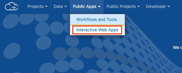
- On the OmicCircos card, click Start. This will open a new dialog when you should set the App name, the Project in which it should run and the Suspend time indicating the period of inactivity after which the app should be stopped automatically.
- Click Launch and a new tab will open. The Platform will start acquiring an adequate instance for your analysis, which may take a few minutes. When finished, the app's landing screen is displayed and you can now start loading data into OmicCircos.
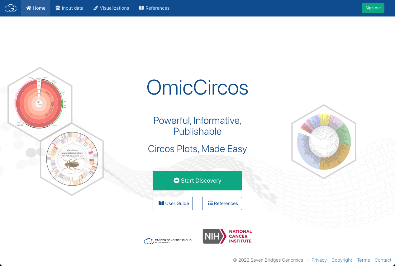
The following options are available on the landing screen:
- Start Discovery: Opens the Input data tab.
- User Guide: Opens this guide.
- References: Provides links to a sample selection of papers that used OmicCircos to create visualizations.
Loading input data
To start loading input data, select the Input data tab on the app's top navigation bar. This displays the Load input data pane on the left. There are four types of data that can be loaded into the OmicCircos app:
- I Segmentation data: Required. Data used to draw the anchor circular track (segment names [chromosomes/genes/pathway names et al.], angles, positions). Please see example input for detail at https://github.com/CBIIT-CGBB/OmicCircos_Shiny or read the OmicCircos usages by examples document (PDF). The segmentation data can be generated by segAnglePo function of OmicCircos package
- II Mapping data: a data matrix which includes values to be drawn in the graph such as gene expression or copy number values per sample
- III Link data: a data matrix used for drawing curves between two anchor points.
- IV Link polygon data: a data matrix used for connecting two segments with a polygon graph.
Supported file formats for all types of input data are .csv and .txt. In case of the .txt format, only tab-separated files are supported. Maximum allowed file size is 100 MB. There are validations in place for angle.start and angle.end columns in segmentation data, which must be in the range from 0 to 720. For more information about OmicCircos input data, read the OmicCircos usages by examples document (PDF).
To load input data, follow the steps below:
- In the Load input data panel, click the tab that corresponds to the type of data you want to load.
- Click Browse files.... A new window opens, displaying project files.
- Select the file you want to use as input data and click Select.
To load multiple files, repeat the steps above for each file. One file can be loaded multiple times. When loaded more than once, there will be a _ suffix next to the file name for each new instance of the same file.
Alternatively, if you want to use example data that is readily available in the OmicCircos package instead of your own data, follow these steps:
- Click Use package built-in data instead.
- From the dropdown, select the data you want to work with. You can select multiple files.
- Click Load data. The data is now loaded and available.
Once a file has been loaded, it will be displayed at the bottom of the corresponding tab in the Load input data pane. There are two actions available for each of the files:
- Preview (): Shows the Data preview pane that allows you to preview and filter loaded data.
- Delete (): Removes the loaded file as an input for OmicCircos.
Previewing and filtering loaded data before creating visualizations
Prerequisite: Input data is loaded.
Once any of the input data types have been loaded, you can preview or filter the data you’d like to use for plot creation directly within the app.
Note that filtering actions apply only to the data loaded in OmicCircos, but won't affect the original files on the CGC in any way.
To preview and filter data, follow these steps:
-
Open the corresponding tab that contains files for the type of data you want to preview (Segmentation, Mapping, Link or Link polygon data).
-
Click the eye icon next to the file you want to preview. The Data preview pane opens on the right.
-
Use the filtering controls to find and filter data:
a. Filter columns: Select which columns to display in the data table below.
b. Entries per page: Select how many data items are shown per page.
c. Search: Enter a search term to show only matching data in the table.
d. Filter values: Enter the value to filter each of the columns by. Depending on the value type, you can type the
value in (strings), select the desired values from a dropdown (factor), or there is a sliding range selector that allows you to define a scope of values to filter by (numeric data types).
e. Pagination: Navigate between pages.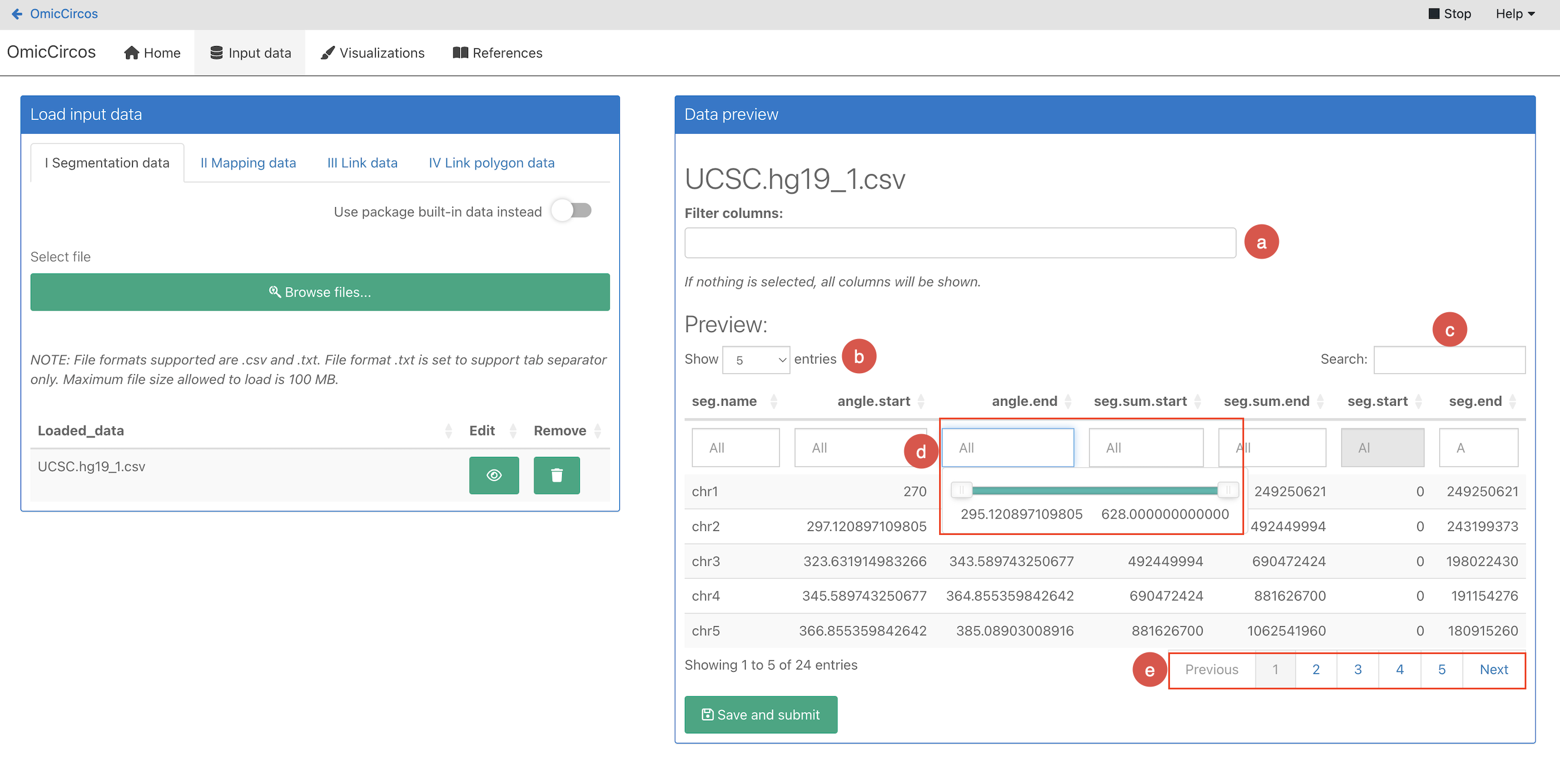
-
Once you are done with filtering, click Save and submit. A message is displayed, warning you that once the filter is applied, it can't be undone and the state can't be restored to the original state before filtering.
-
Click OK. The filter is now applied and the filtered data will be used for plotting later on.
Configuring and generating visualizations
Prerequisite: Input data is loaded and (optionally) filtered.
Once you have loaded input data, you can move on to creating visualizations. To start creating visualizations, follow the steps below:
- On the top navigation bar click Visualizations. Plot type selection is displayed. Note that you can scroll down to display more plot types.
- Select one of the available plot types. Plot configuration window is displayed.
Configuring plot options
Once you have selected a plot type, there is a set of configuration parameters to apply before a plot is generated.
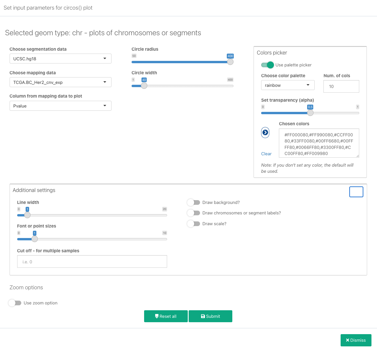
The following parameters are available:
-
Choose segmentation data: Select an available set of segmentation data from the data you have previously loaded.
-
Choose mapping data: Select previously loaded mapping data. Apart from Mapping data, this selection will also contain sets from Link and Link polygon data
-
Column from mapping data to plot: Select the specific column from mapping data that will be plotted. Note that some plots such as heatmaps take this column as a starting column, which means that all data from this column until the last one will be plotted.
-
Circle radius: Define the value for the plot radius. When adding plots, it is a good idea to change the circle radius for each new addition. For example, if you are adding plots that will be drawn starting from the outside towards the center of the circle, reduce the circle radius value so that it is lower than the radius of the last added one.
-
Color picker: Before making a color selection, if there are info messages below the color picker for the selected plot type, please read the messages in order to learn how many colors are needed, how many of them are used for the specific plot type and in what way, etc.
For example, for the ‘b2’ plot type it’s stated that “It is recommended to set 2 colors for this plot type. If you
don't set any color, the default will be used.”, while for the ‘hl’ type the note is “Please, set two colors - one
for the area and one for the border”.To select plot colors, configure the following parameters:
- Choose color: Click to open the color picker and select the desired color and transparency.
- Repeat: If you want the color to be used multiple times on the plot, select the number of times for it to be repeated.
- Click to add the color to your selection. Note that only colors that are added to the selection this way are actually used on the plot.
- Alternatively, click Use palette picker to select a predefined color palette. You can define the Number of colors from the palette to sample, set their transparency and finally add them to the selection by clicking the button.
-
Additional settings:
- Line width: Line thickness for line plots. This will be the only additional setting for hl and highlight_link plot types.
- Font or point sizes: The size of the text labels displayed in the plot (in points).
- Cut off - The cut off is the numerical threshold for color definition. For example, for the cut-off 0, if the value is less or equal 0, the color will be blue and if the value is greater than 0, the color will be red. It is useful in plotting bi-direction data, such as up-regulation and down-regulation data.
- Draw background: Display the plot background (if a background is configured by default).
- Draw chromosomes or segment tables: Draw chromosome labels and segment tables.
- Draw scale: Draw a numeric scale for the values.
The following options are additionally available for the heatmap and heatmap2 plot types:
- Draw color bar: Display a color bar showing the range of colors used on the plot.
- Color bar position: Defines the position of the color bar on the plot. Available options are topleft and bottomright.
- Cluster and draw Dendrogram at left corner: Select whether to draw a dendrogram in the bottom-left corner.
The following options are additionally available for the label and label2 plot types:
- Text side: Display text on the inside or outside of the line.
-
Zoom options: This will allow you to display only a zoomed-in segment(s) or positions of the plot. Click Use zoom option to display the following zoom settings:
- Choose start segment: Select the starting segment of the zoomed-in region.
- Choose end segment: Select the end segment of the zoomed-in region.
- Segment start - position start: Select the starting position of the zoomed-in region within the segme*
- Segment end - position end: Select the end position of the zoomed-in region within the segment(s).
- Zoom area range (angle range): Select the angle that the zoomed-in region will occupy.
-
Once you are done with plot configuration, click Submit. The plot is now added to the plots table.
-
Finally, click Generate plot to generate a plot based on the configuration and the selected data. The generated plot is displayed on the right.
There are two additional options for plot configurations that are saved and displayed in the Circos plots table pane:
- Edit (): Allows you to change the plot configuration.
- Delete (): Removes the plot configuration from the list.
If using built-in human and mouse genome coordinates as segmentation data, chromosome positions will be displayed. If using your own data, it displays the customized chromosomes, genes, or non-genomic segments.
Highlight and highlight_link plot types
In addition, there are two types of circos plots that have different basic settings: hl (highlight) and hightlight_link.
The purpose of the highlight plot type is to highlight the specific area on the plot by setting the, start and end segments (i.e. chromosomes), their corresponding starting and ending positions and the highlight area range (radius range).
Choose ‘hl’ plot type from the plots gallery to display the following highlight plot settings:
- Choose segmentation data: Select the available set of segmentation data from the data you have previously loaded.
- Choose start segment: Select the starting segment of the highlighted region.
- Choose end segment: Select the ending segment of the highlighted region.
- Segment start - position start: Select the starting position within the start segment of the desired highlighted region.
- Segment end - position end: Select the ending position within the end segment of the desired highlighted region.
- Highlight area range (radius range): Select the radius range that will be occupied by the highlighted region.
- Color picker - same as in other plots, learn more
Within the additional settings there is only a line width parameter, which sets the width to the border line of the highlighted area.
The purpose of highlight_link plot type is to highlight the specific linkages that are usually created using link data and link plots (link, link2). Choose the ‘highlight_link’ plot type from the plots gallery to display the following highlight_link plot settings:
- Choose segmentation data: Select an available set of segmentation data from the data you have previously loaded.
- Radius - Define the value for the plot radius. When adding a highlight_link plot, it should usually have the same radius you have specified for link plots, in order to match the links properly.
- The angle range of the first and the second data point to highlight: Set angle ranges and tweak until you are satisfied with the resulting highlighted polygon created around desired links.
- Color picker - same as in other plots, learn more.
Within the additional settings there is only a line width parameter, which sets the width to the border line of the highlighted polygon area.
Customizing generated plots
Prerequisite: Plot configuration is completed and a plot has been generated.
Once a plot has been generated, you can add some additional features and customize how the plot is displayed.
General plot settings
- On a generated plot, click in the top-left corner. General plot settings are displayed.
- Configure plot settings:
- Set plot title: Add the title that is displayed above the plot.
- Set title for x-axis: Set the title that is displayed for the x axis.
- Set title for y-axis: Set the title that is displayed for the y axis.
- Set aspect ratio y/x: Set the aspect ratio between the y and the x axis. If lower than 1, the plot is displayed as an oval shape. If 1, the plot is displayed as a circle.
- Click Refresh plot. The plot is regenerated with the new general settings applied.
Add legends
In order to explain the color and value assignments for the plotted values, you can also add legends to your plot. To add a legend follow the steps below:
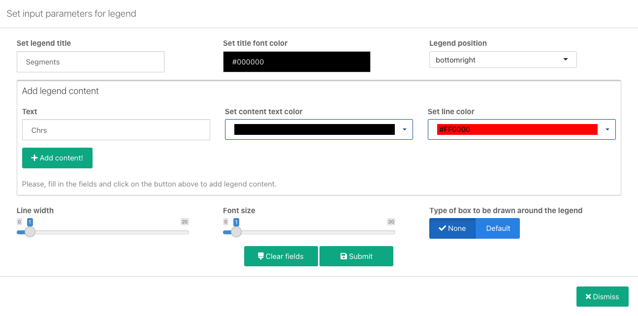
- On a generated plot, click in the top-left corner and select Add legend. Legend configuration window is displayed.
- Set general legend parameters:
- Set legend title: Enter the title for the entire legend.
- Set title font color: Set the font color for the legend title.
- Legend position: Set the position of the legend relative to the plot.
- In the Add legend content section add the first legend item:
- Text: Enter the label that will be displayed for the item.
- Set content text color: Select the matching color for this legend item. You can select the colors available in the generated plots, or from a set of basic colors.
- Set line color: Set the color of the line to be displayed next to the text. You can also select the colors available in the generated plots, or from a set of basic colors.
- Click Add content. The item is now added to the content list. Once added, an item can also be edited or removed .
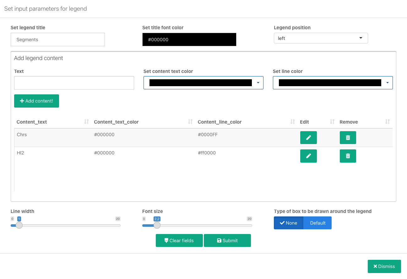
- Repeat the previous two steps for additional legend items that you want to add.
- Configure additional legend settings:
- Line width: The width of the lines to be displayed in the legend.
- Font size: Legend font size.
- Type of box to be drawn around the legend: Whether you want a bordered box to be drawn around the legend. Available options are None (no box) and Default.
- Click Submit. The legend is now saved.
- To display the legend on the plot, click and select Refresh plot. The legend is now shown on the plot.
The list of existing legends is displayed when you click in the top-right corner of a plot. From here, you can edit or remove existing legends, or add more legends to the same plot.
Saving plots
Prerequisite: Plot configuration is completed, a plot has been generated, and any needed customizations are done.
Once you have generated and customized your plots, you can save them for further use by exporting to one of the following widely used formats:
- PNG
- SVG
- JPEG
- BMP
- TIFF
To save a plot, follow the steps below:
- On a generated plot, click Save plot in the bottom-right corner.
- Configure the file to be exported:
- Filename: Set the name of the exported file, without extension.
- Width: Set the image width in pixels.
- Height: Set the image height in pixels.
- Click Update preview to see what the image looks like with updated settings.
- Select whether the plot should be downloaded to your local machine (Download) or exported to the project (Export to project).
- Select one of the available export formats. The plot is downloaded to your local machine in the selected file format.
Removing all plots
When you have already generated plot(s), you also have the option to remove all of them in a single click, along with the plots table. This action will result in loss of all unsaved plots, so if you have plots that you want to save, make sure you do that beforehand. Also note that input data will remain after the plots are removed.
To remove all plots, follow the steps below:
- On a generated plot, click Reset all in the bottom-left corner. A warning about the removal of all plots and the plots table is displayed.
- Click OK to confirm. All plots, along with the plots table have now been removed.
STOPPING OmicCircos
When you are done working with the app, click Stop and then Confirm. This will stop the OmicCircos and take you to the project's Interactive Apps tab.
Updated 5 months ago
