File picker module
The File Picker Module is designed to facilitate the selection of Platform project files. It displays a table of available files, allowing users to choose files based on different criteria. It supports both single and multiple file selections and integrates seamlessly with the server-side logic of your Shiny app.
By leveraging this module, you can streamline file management tasks, enhance user experience, and ensure that file selection is handled consistently across various parts of the application.
UI function
The module UI function creates an action button that triggers a modal dialog for file selection.

The UI function also allows you to customize the action button icon (button_icon parameter) and width (button_width parameter) to suit the needs of your application.
UI function call
mod_file_picker_ui("file_picker_1")
Server function
The server function handles the logic for displaying the file picker modal and managing file selection. It provides features such as table filtering, pagination, and selection modes.
The most crucial argument for this function is files_df, which is a data frame that developers must prepare and provide. This data frame should include columns for file paths and other relevant metadata.
Parameters
| name | description |
|---|---|
| id | A unique identifier for the module instance |
| files_df | A data frame containing the file information. This is the most important argument, and it must include columns for the file paths and any other relevant metadata |
| selection | Specifies the selection mode ('single' or 'multiple'). Defaults to 'single'. |
| file_identifier_column | Specifies the selection mode ('single' or 'multiple'). Defaults to 'single'. |
| default_page_size | The number of rows per page in the file table. Defaults to 10. |
| use_bslib_theme | Choose if the bslib theme is used for the modal UI. Defaults to FALSE. |
Tip
You can use the utility function
get_all_project_files()to fetch all project files along with their metadata from the Seven Bridges File System (SBFS) that is expected to exist on the instance where the app will be hosted.This function returns a data frame containing comprehensive file information, making it an ideal input for the mod_file_picker_server() function.
Note
If your Shiny app utilizes the bslib theme, ensure that
use_bslib_themeis set to TRUE to maintain consistent styling across the modal dialog.
Server function call
mod_file_picker_server("file_picker_1", files_df, selection = "single")
Or
mod_file_picker_server("file_picker_1", files_df, selection = "multiple")
File Picker modal dialog
When using the File Picker Module, you need to specify which information should be returned for the selected row(s). This is done through the file_identifier_column parameter. By default, file_identifier_column is set to path, as this is typically the most useful information for subsequent steps in the application. However, you can set this parameter to any other column in the files_df data frame that contains the desired information.
It is crucial that the specified column, whether path or another value, exists in the files_df data frame provided to the module. The module will return a reactive expression containing the information from the specified file_identifier_column for the selected file(s).
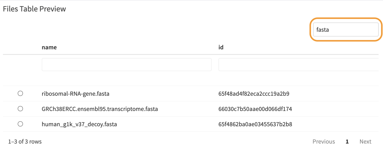
When the modal dialog for file selection opens, the module displays a preview table of files and allows users to select files based on the specified selection mode ('single' or 'multiple'). Depending on the selection mode, the table will show either radio buttons (for single file selection) or checkboxes (for multiple file selections), enabling users to choose one or more files. Below, you will find examples illustrating both single-file and multi-file picker interfaces.
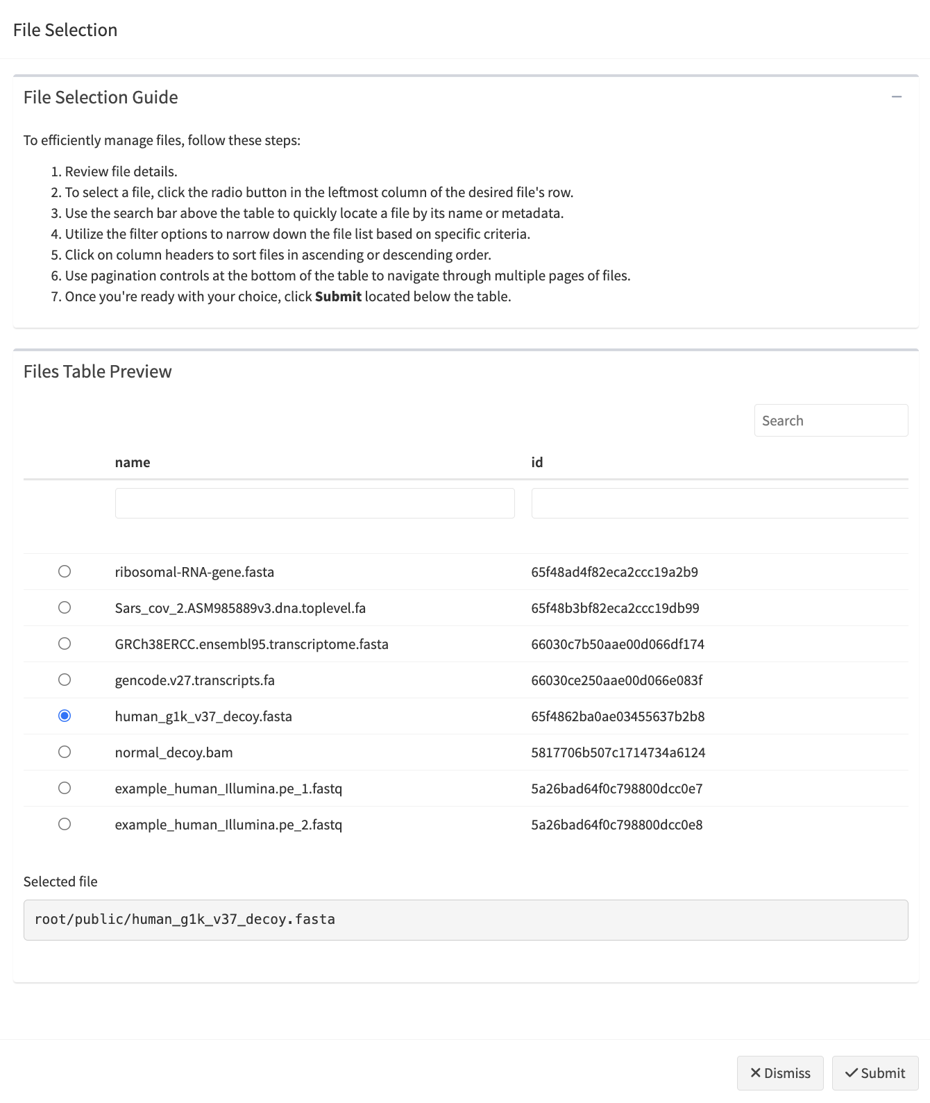
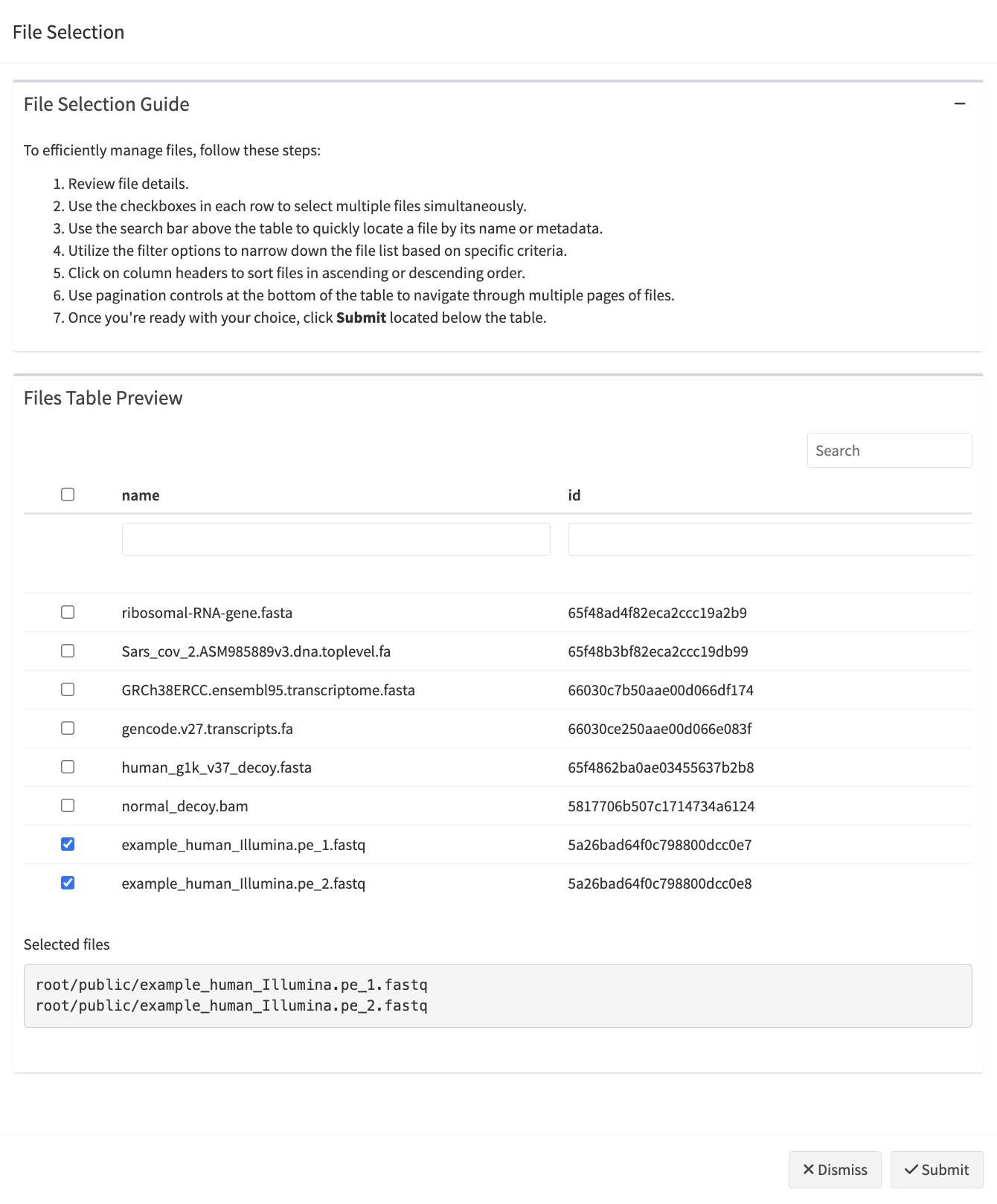
Customizing the File Selection Guide
By default, the File Picker Module includes a File Selection Guide at the top of the modal, providing users with instructions on how to select and filter files. You can control the visibility of this guide using the show_guide parameter. If set to FALSE, the guide will not be displayed, giving you the flexibility to hide the instructional content entirely.
If you wish to provide customized guidance specific to your app, the guide_content parameter allows for custom content to be displayed within the guide. By providing a path to a Markdown file (.md), the content of that file
will be converted to HTML and rendered inside the guide. This feature is particularly useful for projects where detailed or project-specific instructions are necessary. Check an example of a Markdown file.
Table options
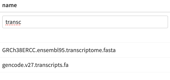
Table columns are equipped with various filter options depending on the type of data:
-
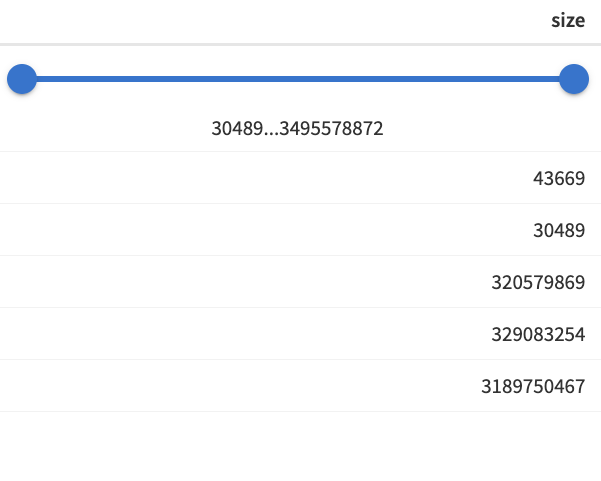
Numeric columns: a range slider filter allows users to narrow down the table by selecting a range of numeric values.
-
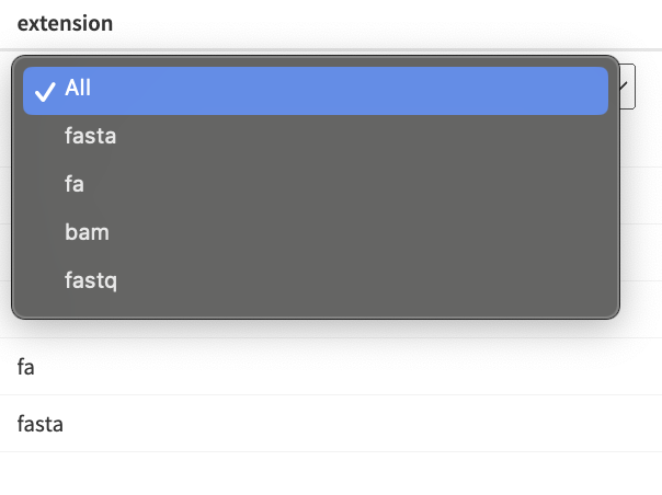
Factor columns: a drop-down filter enables users to filter the table by selecting specific factor levels.
-
Other data types: a basic filter with case-insensitive text matching is available for other data types.
Additionally, a general search box allows users to search the table by entering a term. This search will return all rows that contain the search term in any of their columns.
Check out the example application showcasing the file picker module here: inst/demos/file_pickers_demo_app.R.
Updated over 1 year ago
